Circfit
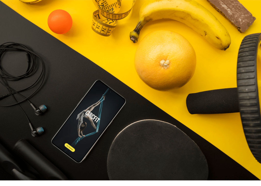
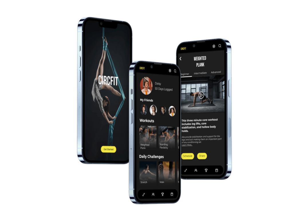
CircFit is a fitness app made for the circus artist. Gain access to apparatus specific workouts, target muscle groups with guided workouts and share your progress with your friends. From the beginner to the professional, CircFit makes training accessible to everyone who loves circus arts.
Problem
Solution
Current fitness apps on the market do not cater to the specific needs of a circus artist. They do not provide circus specific training or workouts tailored to a circus apparatus or skillset. This limits artists in staying circus fit, inspiring their training and connecting with other professionals and friends.
I designed a circus fitness app for both the casual and the professional circus artist. It offers guided workouts for circus specific training, the ability to tailor a workout to a certain muscle set or apparatus, and provides a place to share workouts and progress with friends. CircFit is a fitness app made for the circus artist.
Team
Kriss Bicking,
UI Designer
Timeline
2 months
Date Completed
November 2023
This project was a concept piece for my UI Design bootcamp with the remote certification company, CareerFoundry.
The Design Process
Utilizing agile and lean design, I completed four sprints for each stage of the design process.
1. Ideation
2. Wireframing
3. Style Guide
4. Breakpoints
Ideation
“I envisioned a circus fitness app that would provide circus specific training to everyone who loves the circus arts”
Kriss

During my UI Design education, I was inspired to create a fitness app tailored to the circus artist.
The circus arts encompass a variety of disciplines with a diverse set of workouts needed to build and maintain specific sets of muscles.
Circus artist lacked an app tailored to their specific needs. I knew, because I was one of them.
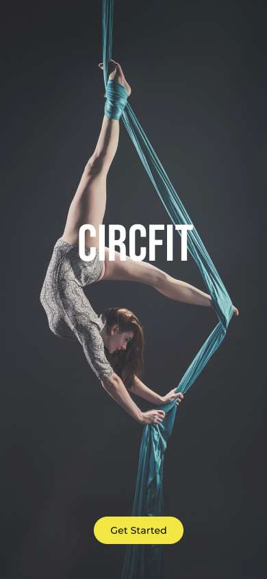
Photo: Kriss performing a circus act
Market Research
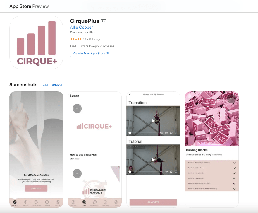
Research showed several circus training apps on the market. Cirque du Soleil offered a small selection of desktop circus workouts while other smaller circus apps combined circus skills with pole dancing skills and had no guided workouts. Cirque+ was the only fully built circus training app but its content was limited and its branding not in line with other top fitness apps.
The data revealed there was a gap in the market. Circus artists needed a top tier fitness app that provided them with circus specific workouts.
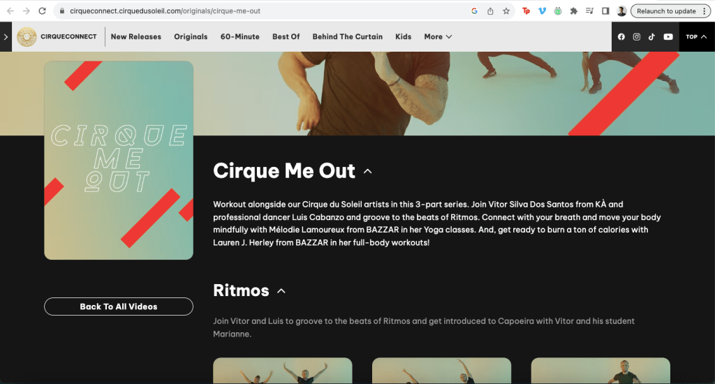
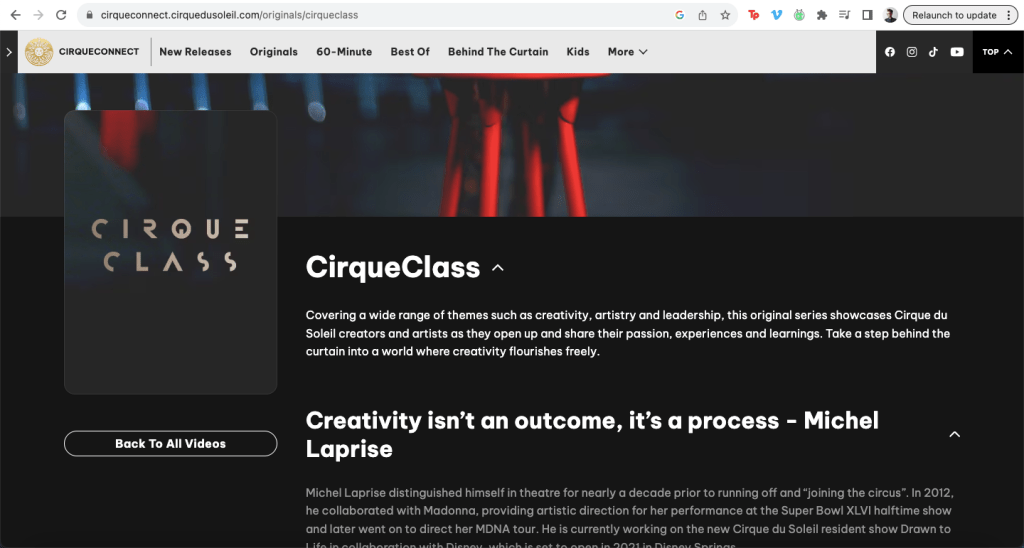
Cirque du Soleil offers online lessons for a small selection of circus skills.
Mood Boards
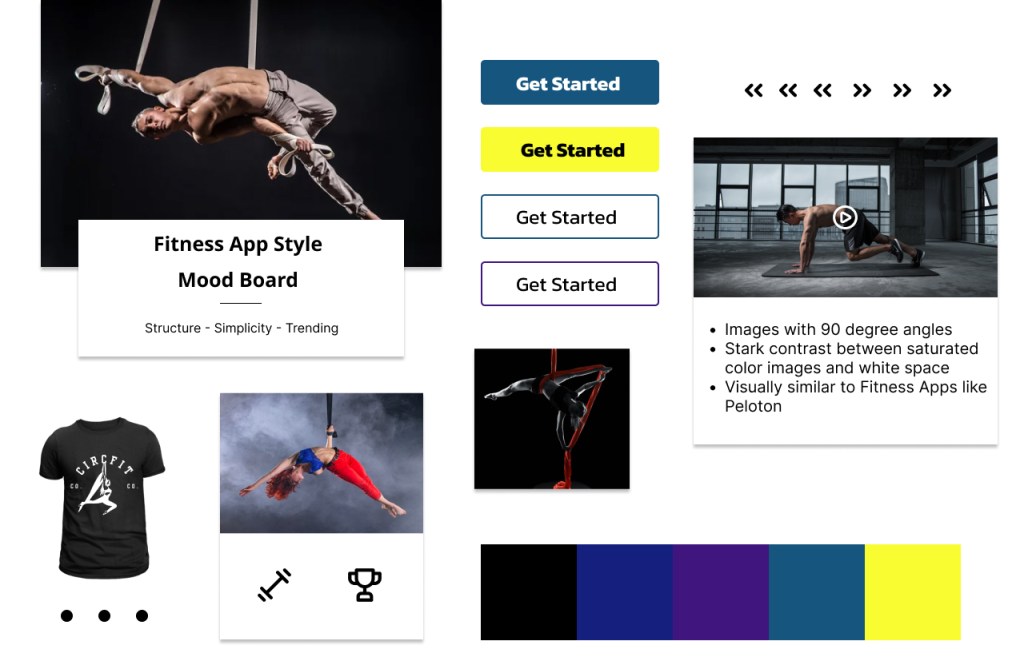
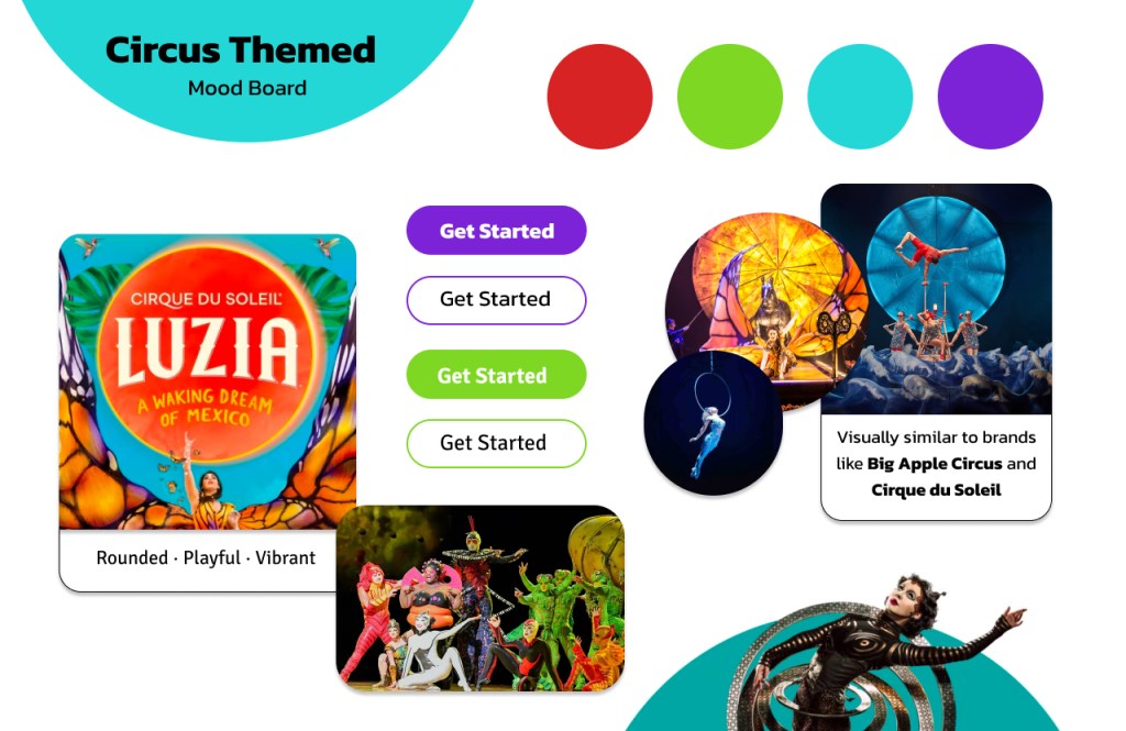
I wanted to create a visual brand that resembled other top fitness apps. I created two mood boards in two different styles.
One board was inspired by top circus companies like Cirque de Soleil with bright, primary colors and rounded buttons. The other mood board was inspired by successful fitness apps like Peloton with a darker color palette and a pop of vibrant color.
Designing a visual style in line with successful fitness companies such as Nike and Peloton provided a solution to the problem statement: a top fitness app for both the professional and casual circus artist.
I chose the ‘Fitness App’ mood board for this project.
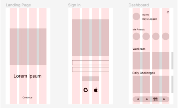
Wireframes
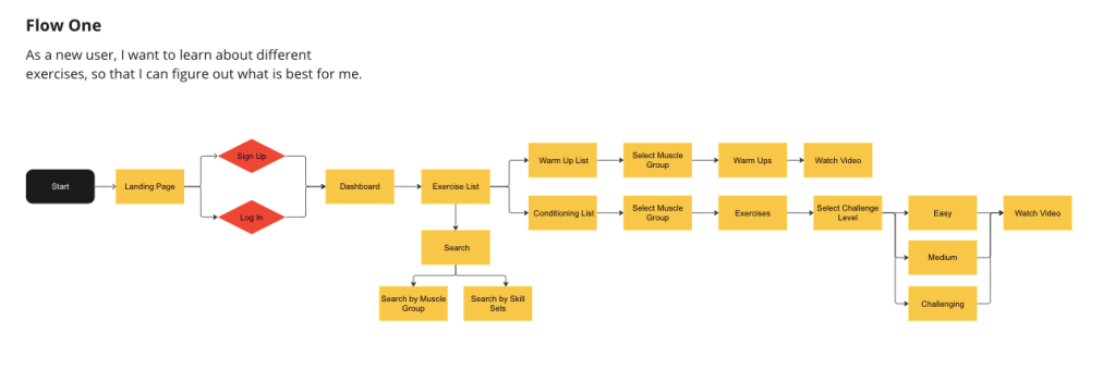
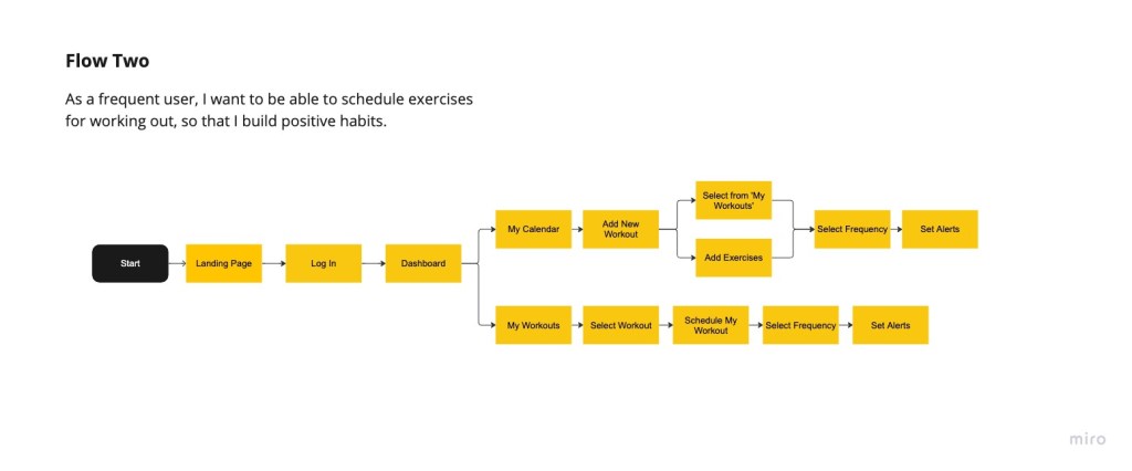
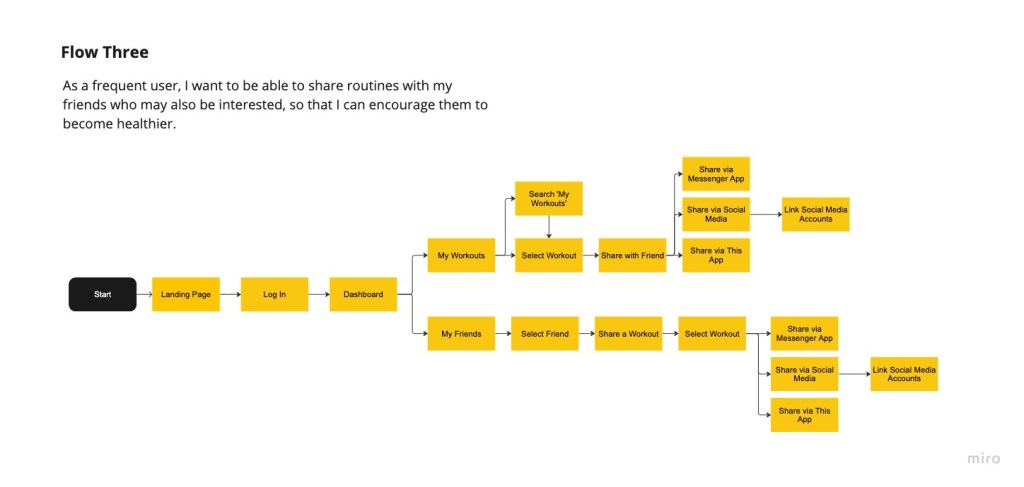
Agile design played a heavy role in my approach to wireframing. I looked to the project brief to get business and user requirements, then selected three user stories from the UX information provided. These I translated those into user flows, which expanded into wireframes.
I created wireframes quickly in order to begin testing for pain points, knowing that the design process would continue to reveal flaws that would be refined. Efficiency, especially with a team of one, was priority.
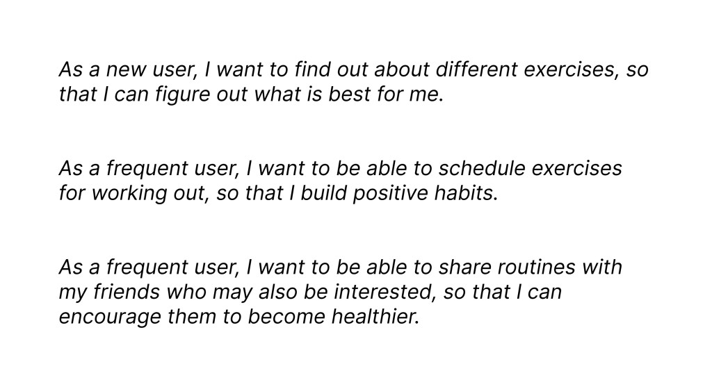
user Stories
User Flows
Wireframing
I started with low resolution wireframes for a mobile breakpoint in order to discover the base elements the app needed. From those designs, I would expand to tablet and desktop breakpoints adding more elements as needed.
I designed a guideline for grids and columns. As sole designer on this project, creating a spacing guideline was imperative to remain consistent across all breakpoints in order to provide a cohesive feel to the app.
Columns: 4 • Gutters: 20px • Margin: 35px
Style Guide
With the low fidelity wireframes going through the agile design process, I turned to lean design to create a style guide with color palette, typography, iconography and imagery. I also laid out guidelines for gestures and transitions.
Color Palette
I created three palettes to choose from. Option #1 and Option #2 were in line with my ‘Fitness App’ mood board. Option #3 offered a new perspective. I like to keep my mind open to new directions while designing.

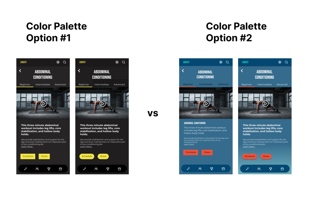
AB testing reveled that Option #1 was the more effective color palette for the app. It remained consistent with my vision for a professional fitness app like Nike and Peloton.
Typography
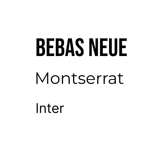
To suit the tone of the color palette, I searched for a font pairing that would convey strength, capability and professionalism.
The strong and simple look of Bebas Neue paired with Montserrat offered strong visual hierarchy. Inter provided a professional look for text bodies. These three fonts added to the app’s tone of strength and professionalism.
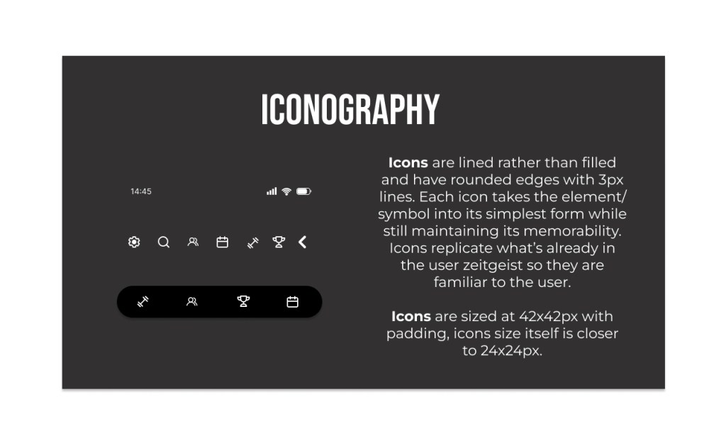
Iconography
Familiarity for the user was a priority, so I chose an icon style that was simple, lined and rounded. This icon style is used across other fitness apps like Nike and Peloton.
Learning Moment
During mobile icon testing, I discovered a pain point. I had not designed enough of a touch field around the icons resulting in a suboptimal performance when tapping the icon.
All of the icons within a breakpoint need to be the same size with appropriate padding in order to compensate for a touch field. And icons of different orientations need to have the same overall height in order to provide a seamless visual. I learned the importance of the precision of icon dimensions for both padding and overall size.
Imagery
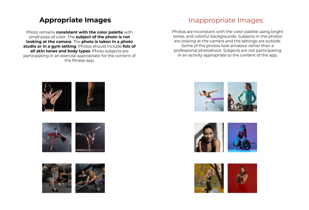
Now that the visual design was taking shape, I moved onto selecting images. The tone of the placeholder images suited the branding I was developing: high saturation and deep shadows with pops of color. I compared them to my original mood board and found them consistent with the branding.
In order for the photos to convey the sense being “in action”, I chose images where the subject was in movement and not looking at the camera. Reflecting the places the user would engage with the app, I selected images of people in the gym or working out at home.
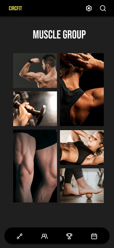
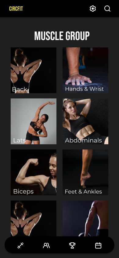
Refining The Visual Layout
Selecting the imagery guidelines inspired a new idea for the layout of images and lists. Originally, I was drawn to a collage style but ultimately found a symmetrical layout provided clearer visual hierarchy.
Gestures and Transitions
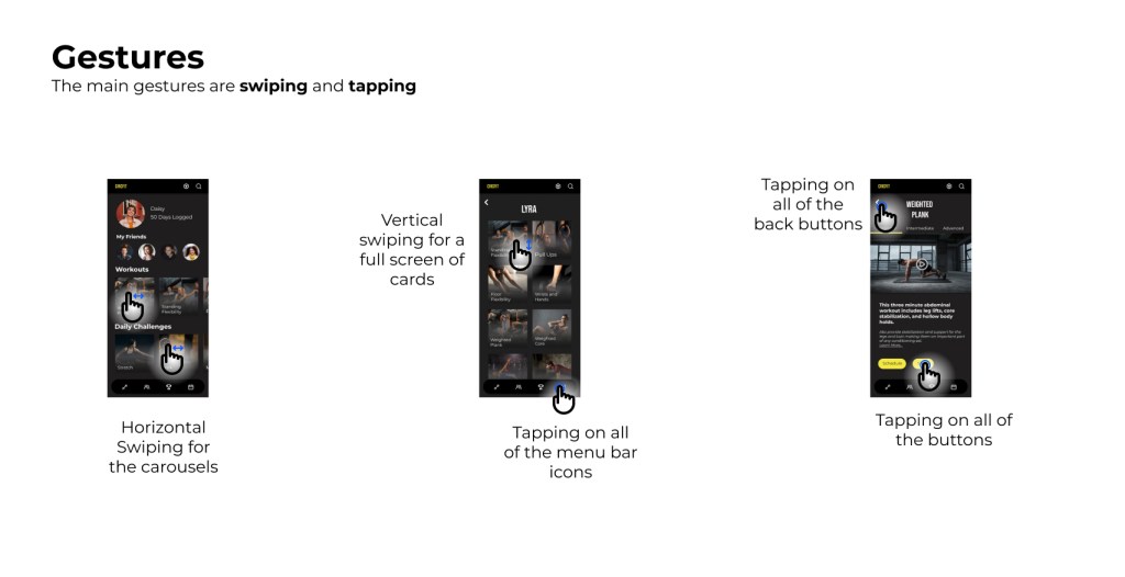
Because it was important to consider both new users and infrequent users, I kept the gestures familiar and simple. I included gestures that users would already be familiar with because of their use on other popular apps and digital devices.
To provide the user with smooth navigation, I designed the screen transitions to be intuitive and mimic real world experience. This intuitive, directional approach allowed the user to visually keep track of where they were in the app.
For example: Tapping an icon on the bottom menu bar would show a screen moving up into frame. Tapping the “Back” button would show that same screen collapsing back down into menu bar.
Breakpoints

To ensure high memorability for new users and infrequent users, I added clearly defined columns at each breakpoint.
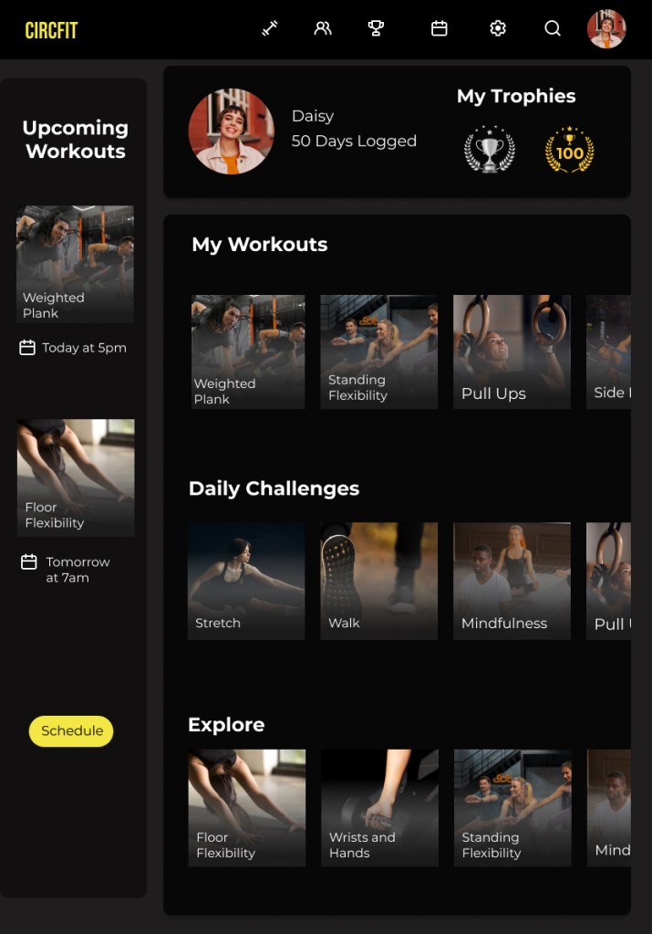
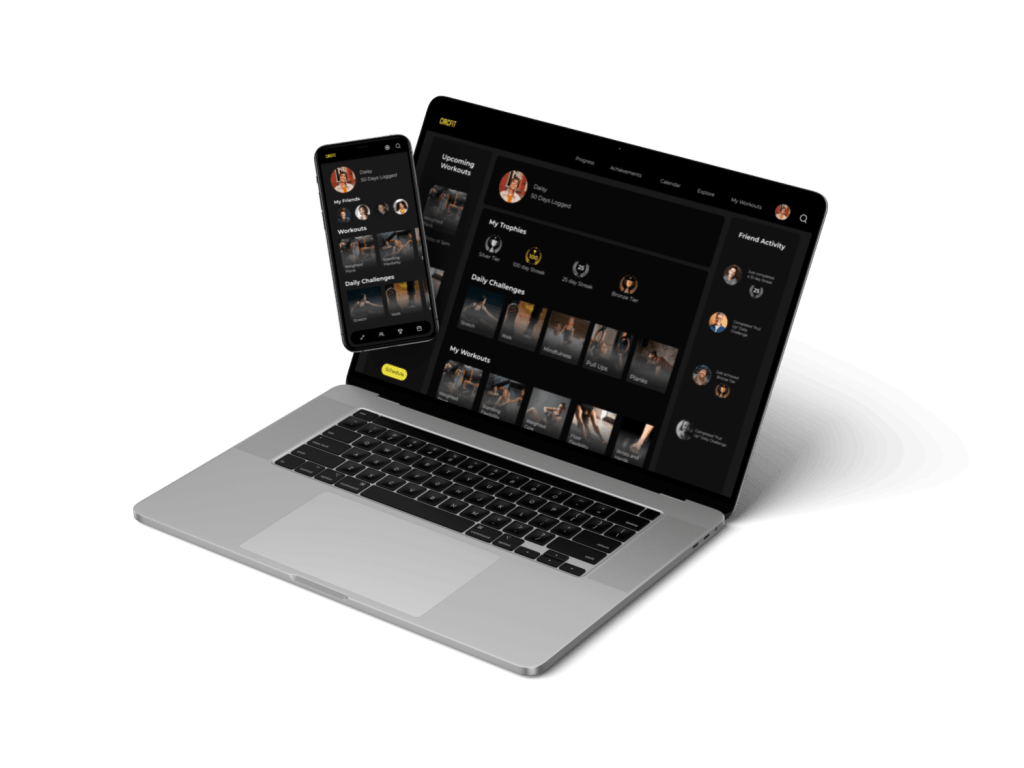
The first breakpoint added a column on the lefthand side of the screen showing a lineup of upcoming scheduled workouts. This would be added on the tablet breakpoint.
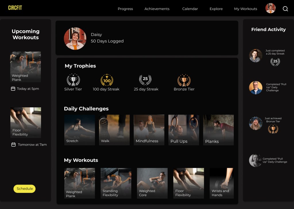
The second breakpoint kept the left hand column and added an additional column to the right hand side showing friend activity. This would be added to the desktop breakpoint.
These breakpoints are prevalent on streaming platforms such as Spotify making it familiar to the user and enabling them to accomplish their goals on the app with ease.
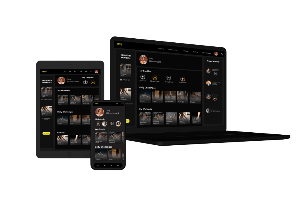
Final Mockups
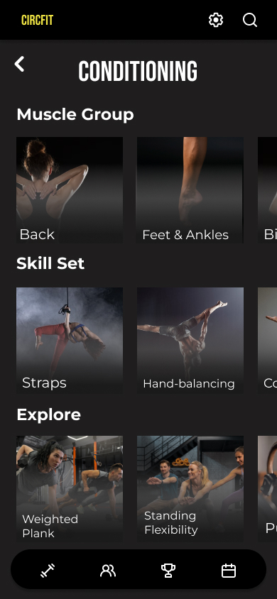
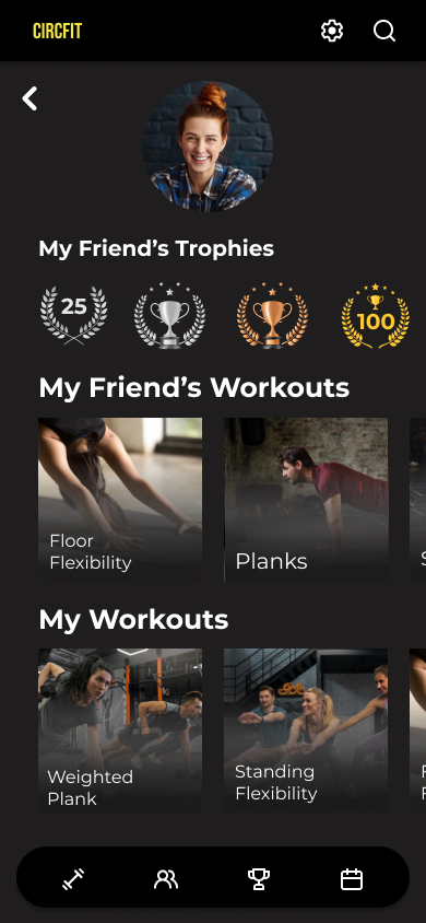
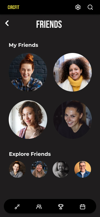
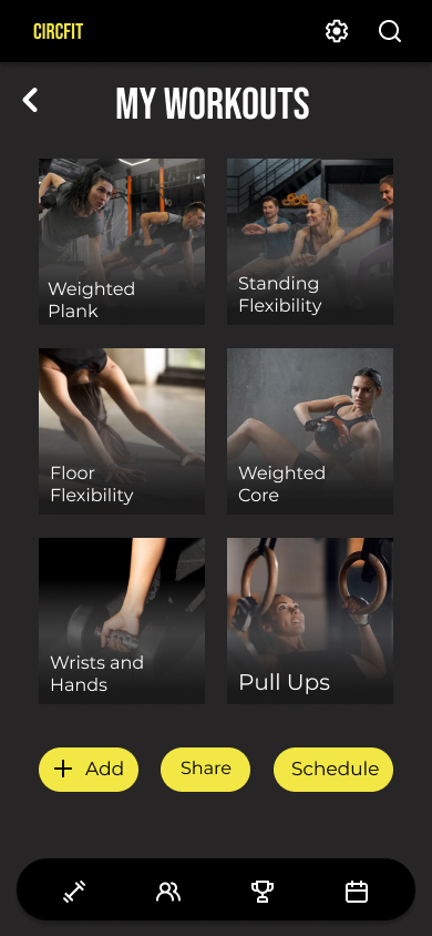
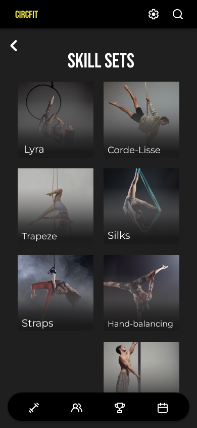
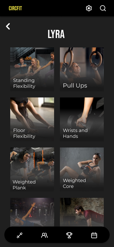

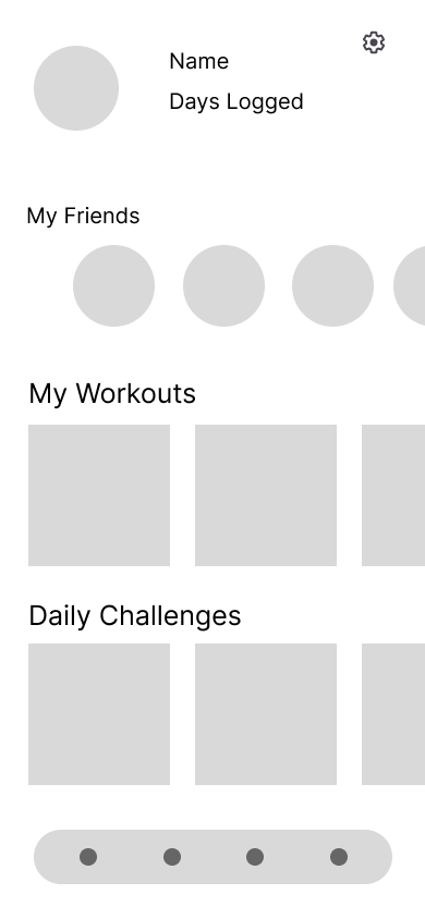
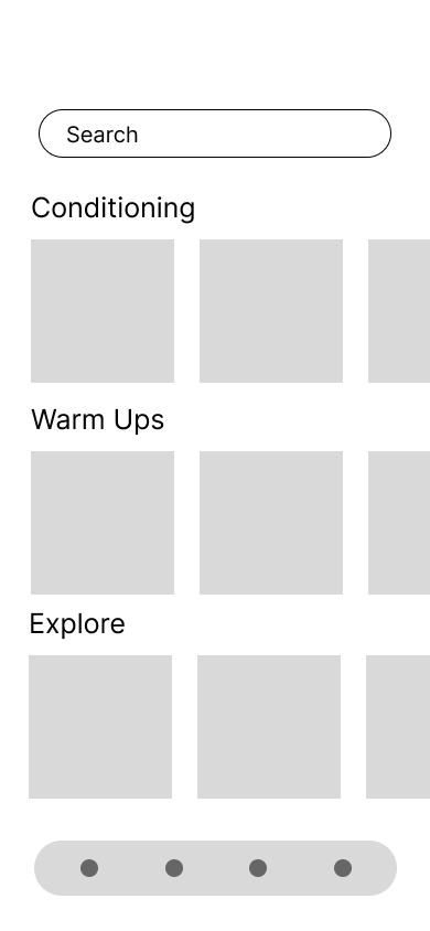
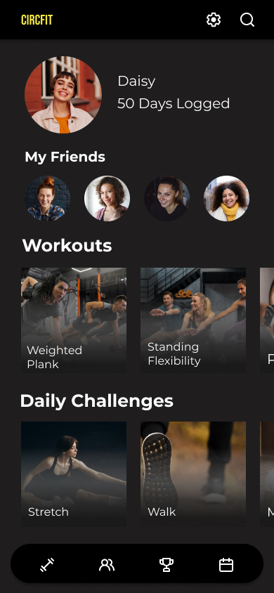
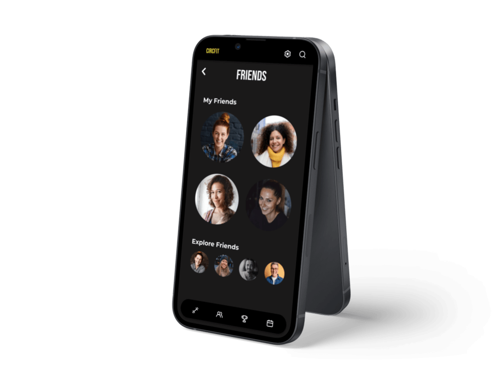
Mobile Mockups

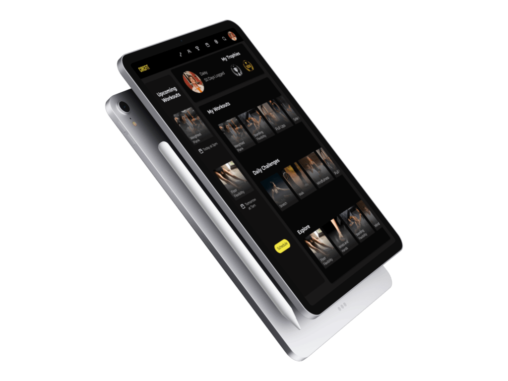
Tablet Mockup for ‘My Workouts’ page
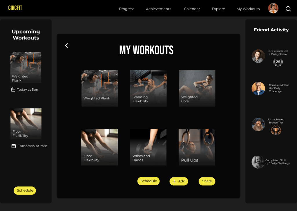
Desktop Mockup for ‘My Workouts’ page

CircFit


 Kriss Bicking