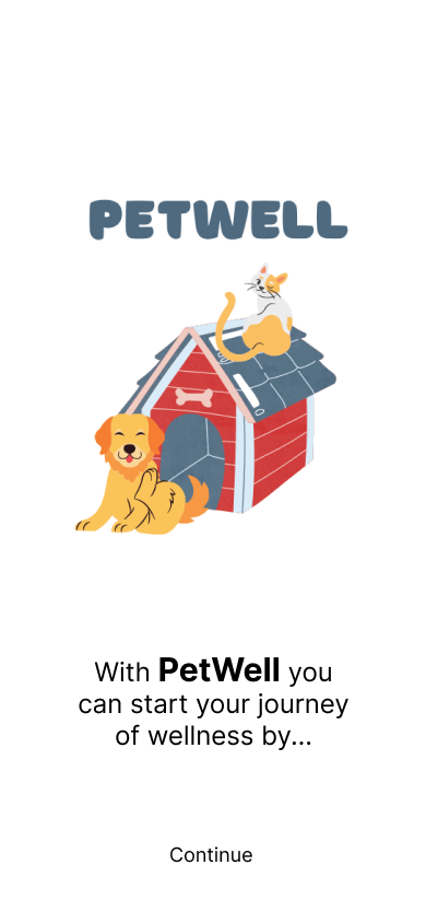
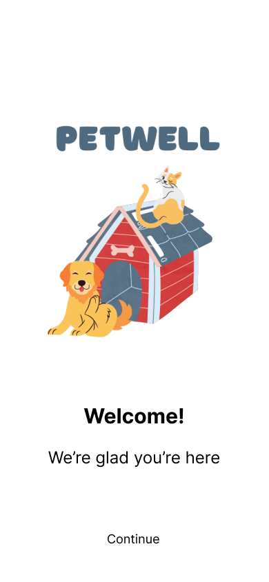
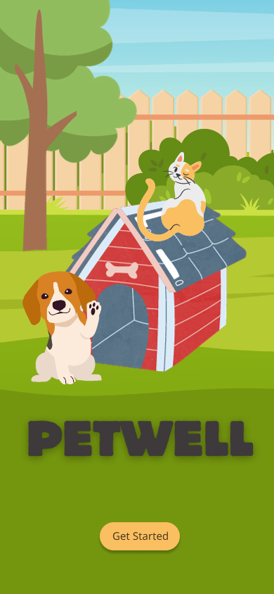
PetWell is a wellness app for people who want to develop healthy habits and have fun along the way. Adopt a digital pet, choose your real world health habits and earn treats and outfits for your little digital darling!
Problem
Many people want to learn how to improve their mental wellness and learn how to stay consistent with their goals. Due to wellness gaming apps being a new genre, there was a particular challenge in creating an onboarding process that showed the user what the app was about, how it would benefit them and how to use the app to reach their goals.
Solution
Throughout the design process, feedback from user interviews and user testing was crucial in solving the problem statement. The testing feedback allowed me to rework areas that were confusing in order to create an app that was fun, fulfilling and set the user up to achieve their mental wellness goals.
Team
Kriss Bicking, UX and UI Designer
Timeline
6 months
Date Completed
June 2023
PetWell is an app concept developed for my UX Design education through the remote certification company, CareerFoundry.
Agile Design Process
I used agile design and human centered design to address the problem statement dividing the development process into three stages.
1. Understanding the User
2. User Flows
3. Wireframes


Understanding the User
Pain Point
Many folks want to better their health by establishing healthy daily habits. However, they often do not to know where to start and they struggle to stay consistent with their goals.
Solution
By conducting market research and user interviews, I focused on building an app that would educate the user on what wellness can look like by offering curated wellness packages based on wellness goals, and by providing gaming incentives to keep the individual consistent.
Deliverable
This solution led to creating a primary user persona to help guide the development of the app. Understanding who will be using the app is vital in keeping the design focused and effective.
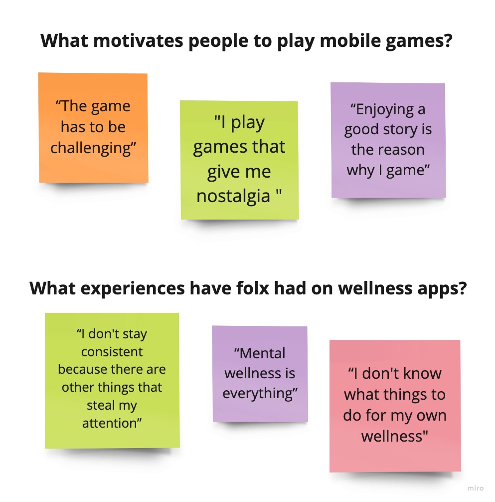
User Interviews focused on answering the question: What experiences have folks had on gaming and wellness apps?
What I discovered is that folks enjoy playing games that provide a challenge and resonate emotionally. And although they have used wellness apps sporadically, they struggled to stay consistent after the onboarding process.
Primary User Persona

By synthesizing the information from my user interviews, I created a primary user persona to understand the needs and wants of my target audience.
I would continue to reference my primary persona at each stage of the design process, particularly as I conducted User Testing and AB Testing.
User Flows
Pain Point
The onboarding process confused the user because they did not understand the purpose of the app.
Solution
Card sorting exposed the need to clearly explain the purpose and function of the app. As this genre of “gaming for wellness” is relatively new, folx needed a full explanation to understand what the app was about and how they would benefit.
Deliverable
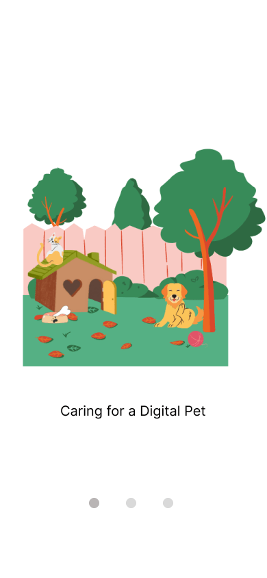
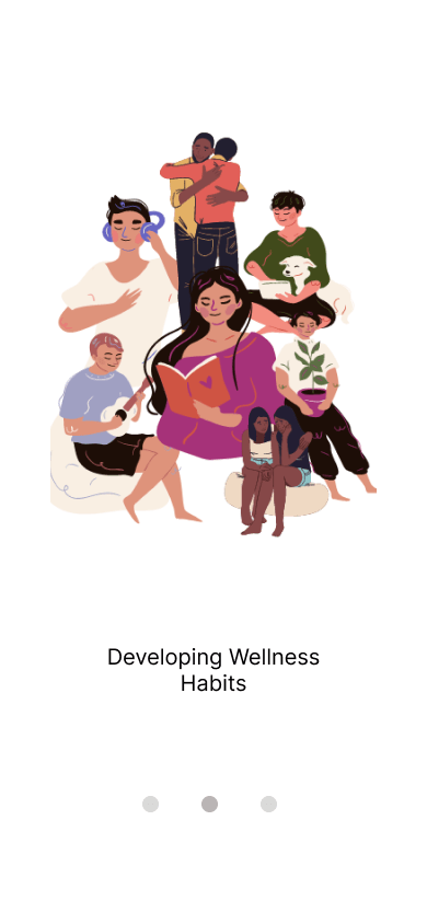
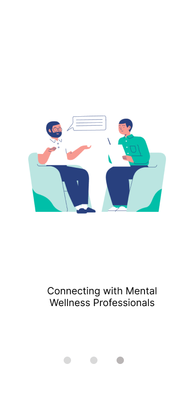
I created User Flows that provided the user with a clear understanding of the app from the splash screens through the onboarding process.
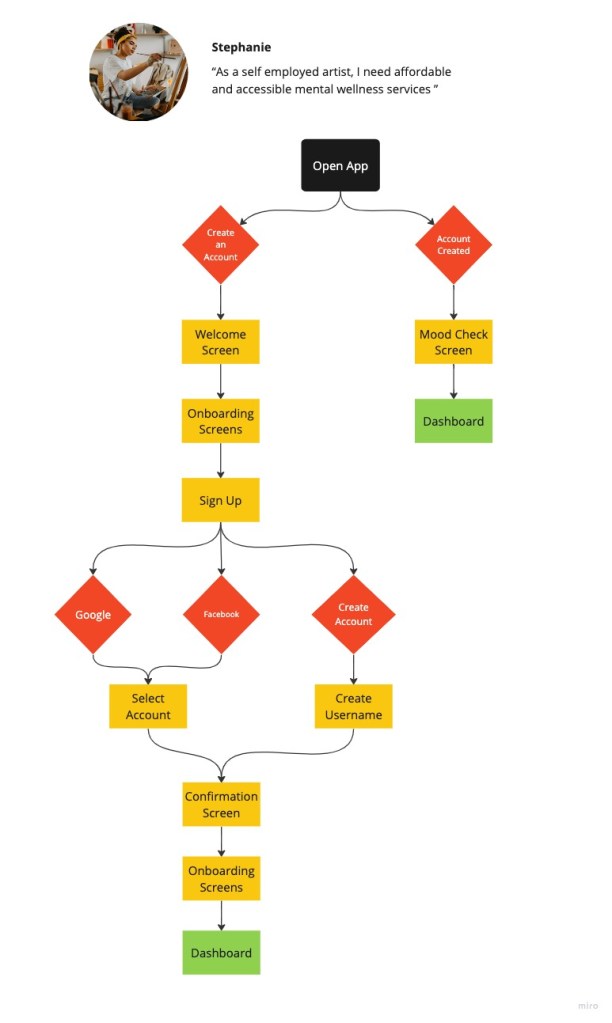
By mapping user flows based on the information from research and interviews, I was able to paint a clear picture of how Stephanie will navigate the app.
Flows, like the one pictured, were edited and expanded as the app continued to develop.
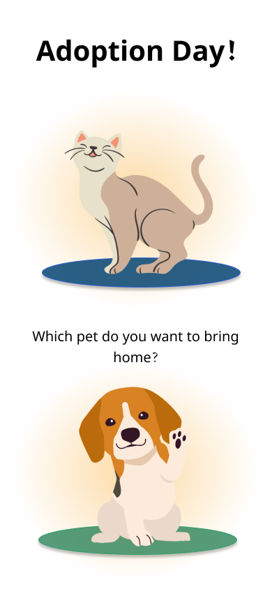
Wireframes
Pain Point
It was unclear how the users real world actions affected the care of their digital pet.
Solution
Usability testing with a mid-fidelity prototype exposed gaps in the onboarding process creating opportunity to clarify the link between the users real world actions and the care of their digital pet.
Deliverable
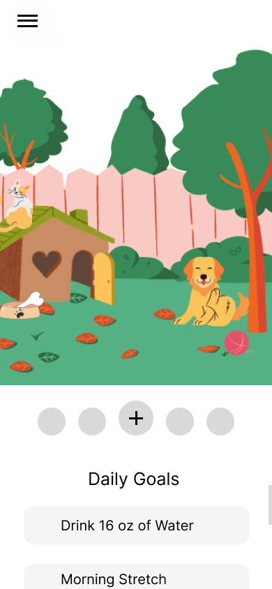
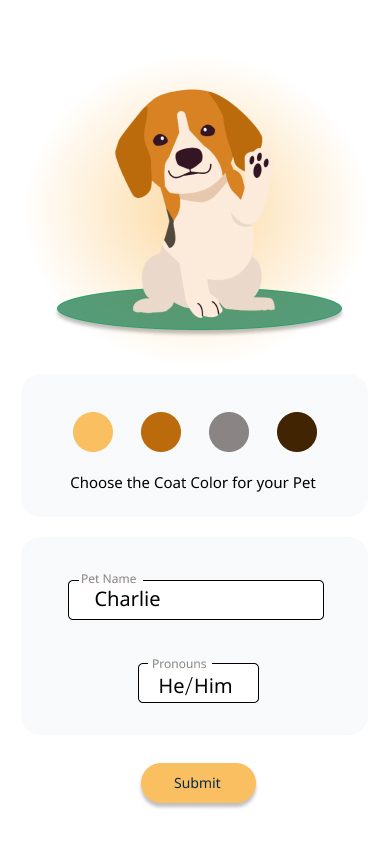
I created a prototype with mid to high fidelity wireframes to test on my market audience in order to refine the clarity of message, smooth out the onboarding process and create cohesive visuals in the app.
Combining the data from my user interviews, card sort, and user flows, I started sketching paper wireframes.
Using Figma, I digitized the paper wireframes into mid-fidelity wireframes that expanded on several user flows creating a basic prototype of the app.
I tested this basic prototype with individuals in my target audience.


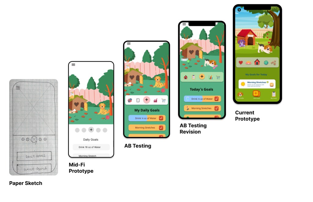
After several rounds of usability testing, I discovered that the link between how the digital pet interacts with the user could be strengthened for better gaming.
I edited the onboarding user flows to clarify that this is an app for humans who sought wellness through caring for a digital pet.
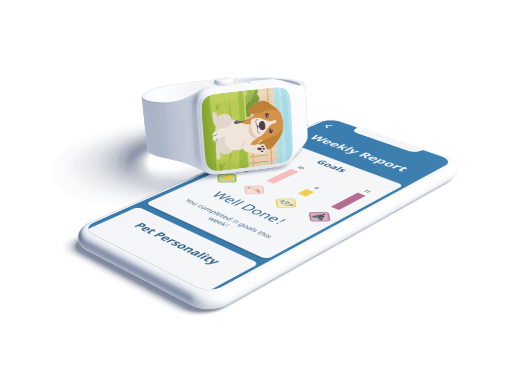
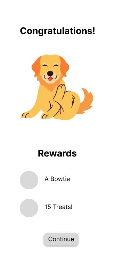
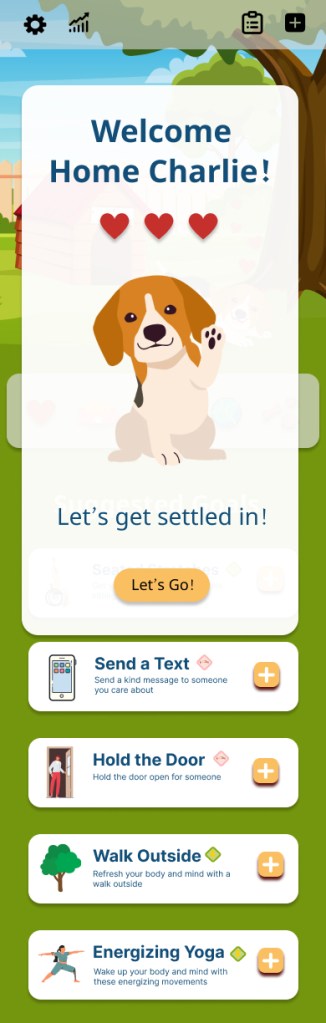
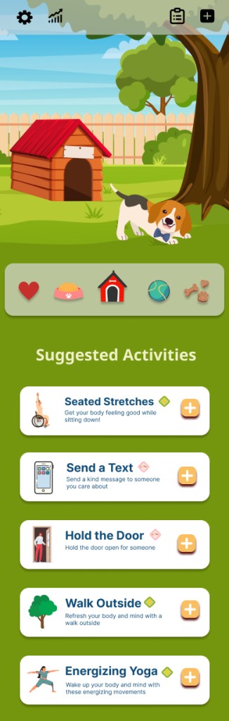
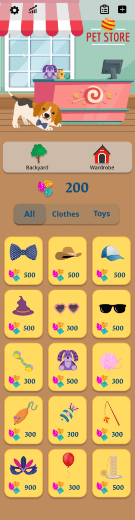
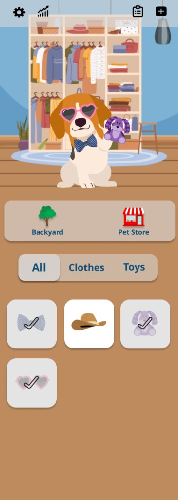
I also revised the gaming features; now the users real world actions shape the personality of their digital pet. This creates ongoing intrinsic rewards for users like Stephanie by seeing the results of their efforts in their digital pet.
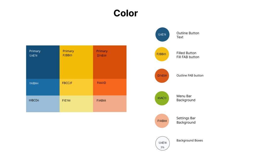
Using the feedback from my User Prototype Testing, I enhanced the mid-fidelity wireframes by refining buttons and re-writing the copy to provide clarity as to the function of the app. I began dialing in the UI elements: color palette, button sizes, font selection and text color.
During this process, I ran AB Testing on various UI elements. From that data I refined the color palette, images, buttons and copy into my Final Mockups.
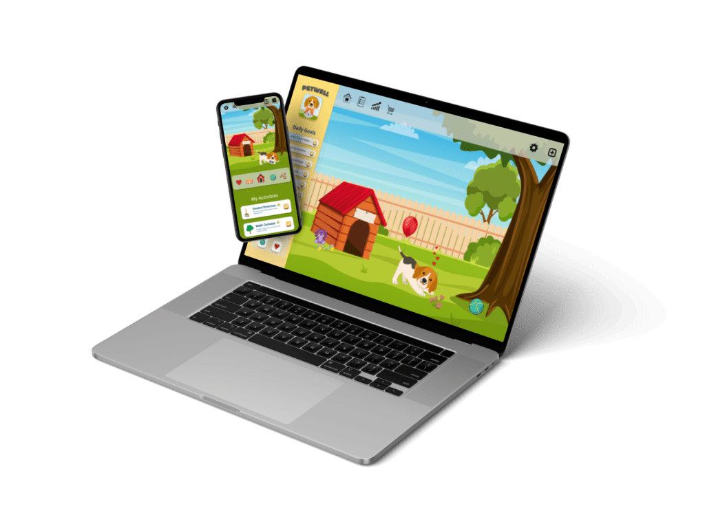
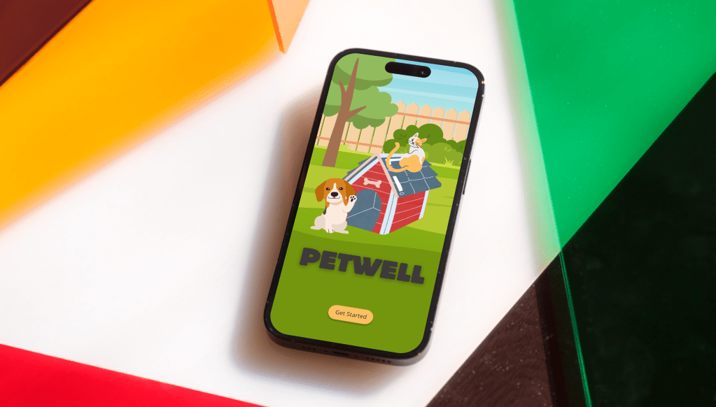
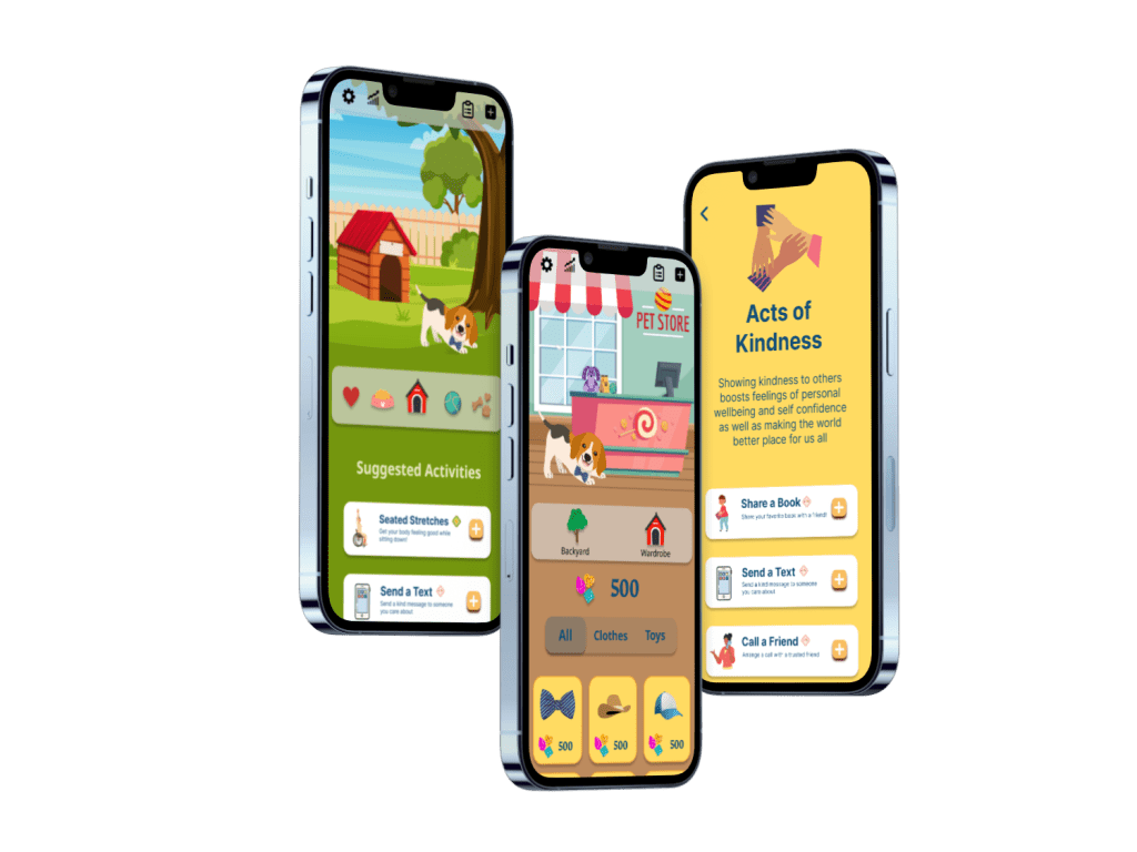
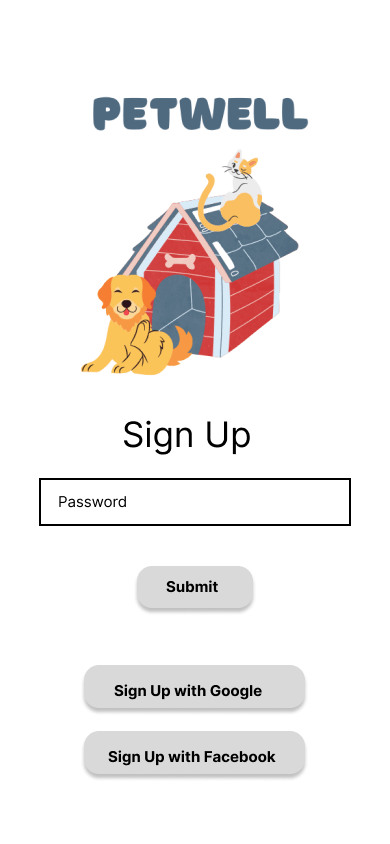
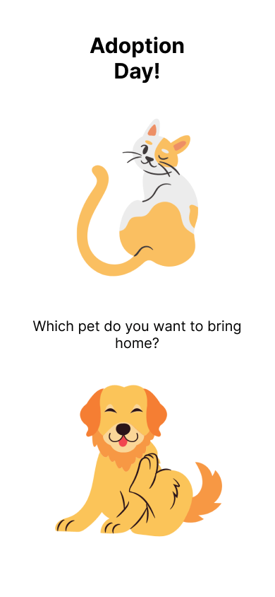
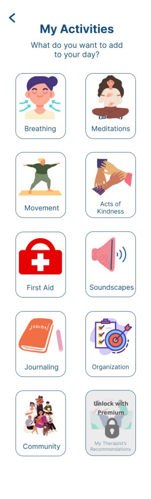
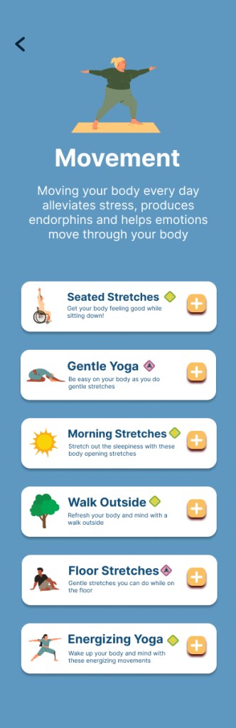
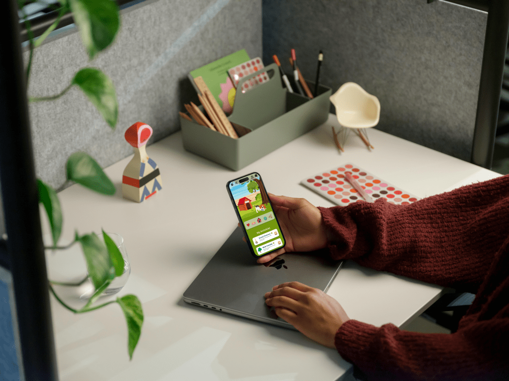
Final Mockups


Design Documentation
The style guide for the project includes iconography, color palette, copy guidelines, buttons, typography and imagery to keep the style and UI consistent.